Games art evolution
This is a time line of the evolution if graphics with 10 games as examples from 1986-2015
_________________________________________________________________________________
Collage Photoshop Picture
For this artwork I took a picture of a beloved mascot and Photoshoped him into this. First I copied the image onto a different layer and used the lasso tool to cut out his face and replace it with an old man face, then I used the brush tool at a low opacity to make him yellow, I then used the cut out face, shrank it and put it on his tale. Then I copied his face again and put it next to the old man face and used the paint bucket tool to make all his black parts pink, red and green. I then copied the faces of kittens onto his hands to complete it and named it Pikaslow.
_________________________________________________________________________________
27/9/2016
Making Photoshop Brushes:
These are all different brushes and textures I both created and got from Google Images.
To do it I had to (When drawing) go over to edit and select Define Brush Preset, and when off images I had to first make them black and white in adjustments then turn up the contrast and brightness then select Define Brush Preset in edit to make the brush
To create these brushes we used Ink to draw out patterns with different materials such as brushes, Lego cars, paper towels, foil and stencils.
Then to make them in Photoshop we copied them over on to our drive, downloaded them then opened them in Photoshop them used the lasso tool to isolate them and then repeated the same process from our digital paintings. Then used the same process as making our own paint brushes, black and white in adjustments then turn up the contrast and brightness then select Define Brush Preset in edit.
_________________________________________________________________________________
Drawing practiseHere we were told to draw our hands using different extreme methods such as taping the pencil to our chins, knees and elbows the point of which was supposed to increase our confidence in our drawing abilities by not being physically possible to draw good using our chins or elbows etc.
The one in the middle was drawn using my right hand(dominant), the left was done using my elbow, and the right was using my knee as part of an extreme experiment.
These drawings are based on my left and right hands. Above is some examples, the left one was drawn using my dominant right hand, the middle was done using my left hand, the one on the right (hard to see but there) was done using my chin as an extreme experiment.
_________________________________________________________________________________
Photoshop pen tool experiments
These are different shapes I created using the pen tool to draw the outlines, using alt right click to adjust some points, then used Ctrl enter to make it solid then used the brush tool to colour it in.
You use the pen tool by clicking and dragging the points to make curves of different sizes. You can also click on points to erase them.
Pen tool experiment 2 electric boogaloo
This is another experiment, to see how accurate I am with the pen tool I was told to trace over the shapes made by Shiam using the pen tool already, then using different colours to show how successful I was.
Pen tool experiment 3
Pen tool game
This game is meant to test your skills with the pen tool by getting the character home. My highest score is 150.
This mini game test your tracing ability, my score was 92/100.
This is the next level, my score is 342.
Score 97/100.
Pen tool 4
Pen tool tests
These are Pen tool test that I have completed.
_________________________________________________________________________________
Creature Designs
Collaged Creature Experiment
These are creature designs that I collaged together from other natural patterns such as leaves and feathers, as well as animals such as snakes, octopus and zebra as well as jaguar.
I did this by getting organic/nature patterns from Google and copied them to Photoshop where I used the lasso tool to make random shapes on the images from my inspiration page, copied them to a new Photoshop page and made adjustments such as changing size and shape, then I collaged them together, merging the layers along the way, in such a way that they looked liked monsters. After that we were told to let people vote for their favourite collage to adapt along with our own personal choice.
The votes were 9 for creature 6. My personal choice to adapt is design 10 because I like the look and shape of him as well as his "facial expression" and have built a small story behind him and number 6. Though I am sad I am unable to use designs 7 and 9 as they also fit into the little story behind number 6 and 10. I would also like to someday adapt number 1.
The story behind number 10 and 6 is that design 10 wants to believe he is as scary as his father design 6, however in reality he is nowhere near as scary but his father encourages him giving him confidence. And when the hero beats him the father tries to get revenge for his son.
Number 10 is named Gelly Krelly and 6 is named Mazuma.
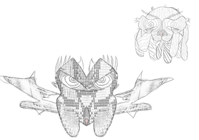 These are the outlines of my creatures that I traced from the original designs using the brush tool. I also copied the pattern from the original and made a brush out of it in order to get a more accurate texture pattern. I like how I have developed my creatures into more scary designs adding horns and more tentacles.
This is the result when I added colour and detail to my drawing. I used red, black, blue, green, orange, yellow and white at first at a high saturation/opacity with the black(wings, mouth), orange(eyes), red(body, tongue) and blue(body accents) then continuously worked on them by adding different colours over the top of them in a low opacity to make them more artistic. Then at the end I used a low opacity small white brush to add patterns on the wings.
I imagine this boss would fit in with a side-scroll shooter game as it looks like a boss with a variety of attacks you need to avoid then take the odd few shots at it to at first destroy its wings then destroy him to complete the game.
This creature is named Gelly Krelly. This is the creature design that I decided to develop. I did this by using a high opacity brush tool to make the outline, then used the same tool to do all the solid colours, green, purple, orange, black, yellow, pink and blue. After I used all the solid colours , green, purple, orange, blue, I then used a low opacity black, yellow, pink and blue colours over the solid colours to make it look much more artistic. I chose those colours because they are not very threatening fitting with his desire to be scary when in reality he is not.
I imagine him as a side-scroll shooter game boss as it looks like a boss with attacks that you need to avoid, that aren't very threatening at all, then use platforms to attack its head to finish it off.
This is an example of his boss stage layout, I created this using the brush and gradient tool in Photoshop.
My favourite part of both designs is there eyes and how similarly they look this led me to create a back story behind them to give them a little character development.
If I could do it again I would choose a different pattern for his body and would give my first one a more threatening colour scheme.
One thing about both that I don't like is that to me I didn't go into enough detail making them more artistic then they are now.
_________________________________________________________________________________
Game artist inspiration
_________________________________________________________________________________
Creature interpretations
This artwork is by artist Mike Ward.
He used blue, red, grey, black, green, dark/light grey, white and yellow colours. It looks like he has used a mixture of both high and low opacity's with the majority of the strokes being a solid high opacity brush. He has used a soft brush at a low saturation for blending colours and has used a high saturation on more solid colours such as in the centre with the large white blob in the middle of the blue stomach. He has also used a hard brush to paint the finer details of the image.
This is my artists interpretation of the art by Mike Ward.
This section is his foot that I drew myself, by first drawing the outline of the foot then the next step was adding all of the details with a high opacity black brush then overlap it with low opacity colours such as black, green, blue and red that were at first high opacity colours but adjusted using low opacity colours such as white and grey.
_________________________________________________________________________________
Artist comparison: H R Giger vs Michael Broom
It is a prototype scary monster design that face looks quite similar to one of my creatures giving me more confidence in it.
It relates to my project as it is the Prototype design for a creature.
_________________________________________________________________________________
Shading techniques
This is a tonal range going from the darkest to the lightest. I did this with a 4B pencil which is one of the hardest pencils hence it is all quite dark. The block is my attempt at shading something harder than a simple sphere.
This is an experiment where we test our ability to make an object look 3D using only shading and tonal ranges starting with simple spheres and moving up to harder objects. The arrow represents the direction of light.
_________________________________________________________________________________
In this exorcise we were told to take pictures of an object from different angles using different styles of light.
This is a from behind low key lighting style. The direction of the light is directly behind the object giving it only a silhouette giving it the effect of mystery, fear and uncertainty as you can't see every detail. This would be in a horror or thriller genre game to introduce an enemy.
A genre example for this style would be crime and a game example would be Limbo or Inside because both games are in complete black and white and use various shadow effects.
This is a full frontal view just like in a film noir. And would fit in with games like Limbo and Inside as this lighting effect gives it a feeling of tension in intense situations.
_________________________________________________________________________________
Creature design observations
Sight only drawing experiment
This is the jaw bone that I drew without looking at the paper and drew by guessing where everything was by just using my eye.
While doing this we were given paper plates to stick over our pencils to make sure that we couldn't see the paper. I drew a jaw because I thought of developing it into a monster mouth.
I found this experiment quite difficult as I couldn't see finer details and I have never done it before, but I must say that when I drew the jaw again I didn't feel like It helped to much.
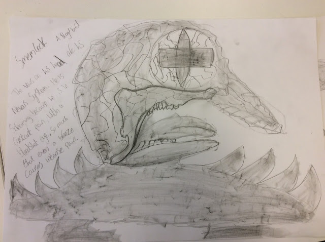
This is the creature I created using the jaw bone as a base, I then developed him by adding a circle for a head, an eye, extra jaw for a mouth, tongue, and a slug body with feet and spikes.
I found the process of developing my creature quite easy as I thought of this design the minute I looked at my finished drawing.
I would use this method of making a creature again, using something else as a inspiration for the design because it almost guarantees a unique and creative design in the end.
_________________________________________________________________________________
Creature designs
These are a few images for reference that I found that inspired my design. The veins for the veins, bloodshot eye for how one is supposed to look, slug for the body, lava for the colour scheme.
For this project we were told to digitally design our monster over the design that we had previously made from the observational drawings we did, and the following pictures are the steps that I took in order to complete it.
Here I started to draw to outline and I decided to start with his head.
In this step I completed my outline by drawing the slug body(I highlighted the original inspiration for my design by outlining it)
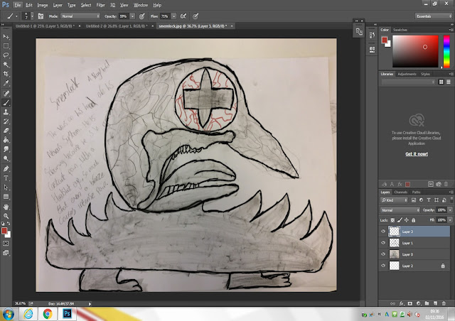
In this step I started drawing out the veins in his blood shot eye.
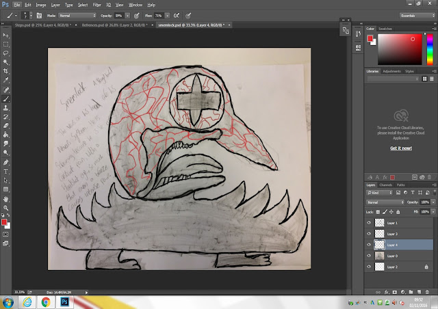
This step had me tracing all of the nerves outside his body with a low opacity red, that I layered on top of each other.
Here it is very hard to see but at points on the nerves I added a low opacity blue to make it look more realistic, as referenced by my vein reference picture, as in real life veins have blue points in them.
I started giving him his colour scheme, after taking inspiration from lava, on a new layer with a low opacity red brush that I layered with darker colours to make it look more like lava.
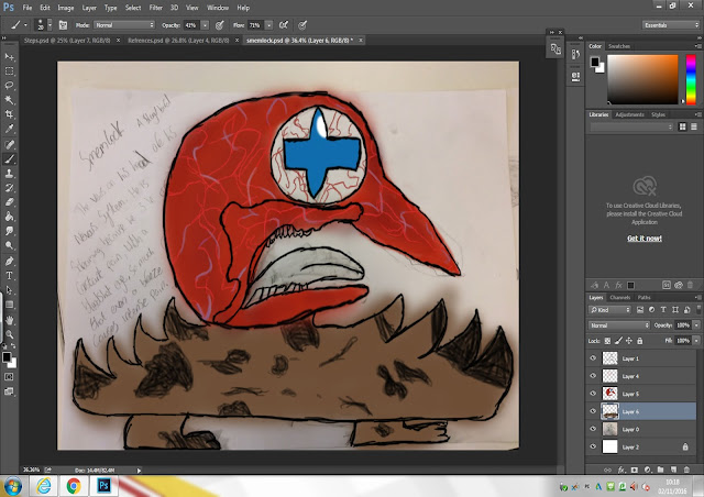
I took inspiration from the body of a slug with the brown and black splotches everywhere.
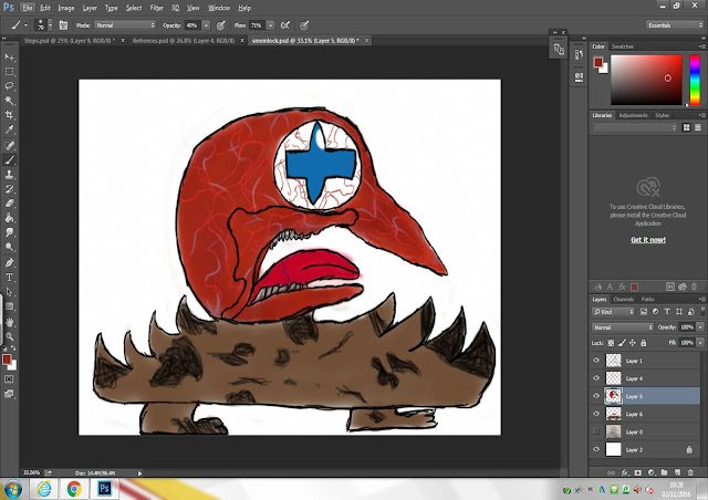
Here I have finalised my creature by cleaning up his sides. I also added a blue line on his tongue because in my mind he screams in pain so much that he always ends up biting his tongue.
This is the last step and to make look in even more pain I made his eye redder. His body is darker to make him look more like a slug. His body is also slightly darker with yellow to make it look more like lava, and I cleaned up the layers around him to make him look cleaner.
This is an extra step I took making the areas around the veins lighter by using the dodge tool, and again on the lower body to make it stand out more, and then using a low opacity purple brush under the veins to make them stand out. And I used a combination of the dodge tool and the burn tool, making it darker, to make the eye look better.
If i could do it again I would give it a better colour scheme to make it look scarier and more realistic/3D. I like how his head looks and his backstory.
But I dont particularly like the colour and design of his lower half as I think they contrast too much to the design of his head.
This is a more developed version of my creature using light techniques that I have recently learned to fit his back story and environment. His environment is a cave in the woods, hence the light bounces off of the grass and trees making it green, and the other side being completely black as the light can't reach the end of the cave. The swirls around his body are meant to represent the dappled light coming through the entrance of the cave and shining through some vines at the entrance of the cave that we can't see.
I feel like I could improve this though by using less black and maybe brighter colours for light and more detailed dappled light.
I think that my intention of having a back low key light was able to be put across to the point where you can easily tell where the light is coming from.
This is my light plan where I plan out where and how strong the light is. The direction of the arrow shows where the light is coming from and the thickness represents how strong the light is.
These are some reference pictures of how light looks in a cave and some dappled forest light for how the light should look in a forest, where he is hiding.
This was an experiment to see how light of a different colour would work, this was done by my teacher Shiam.
_________________________________________________________________________________
Evaluation
In this course project our aim was to create unique and stylish creature designs, by using materials such as the jaw bone of an animal that served as the base of my final creature design as well as different techniques such as observational drawings, but we mainly worked digitally on Photoshop and used tools such as the brush tool, on low opacity to get more faded and blended colours, and to draw trace the original contour lines and the pen tool to round corners that needed rounding and the eraser for when I made mistakes. I preferred working digitally mostly because it was faster and the tools you needed were always just there. I mainly used the collage in Photoshop by using the lasso tool to cut out shapes from different places such as animals and things like leaves, which I stuck together into a strange shape, then after I was happy with the result I used the brush tool to draw contour lines and develop further, this served as inspiration for my final design as well as critic from my teachers and through their critic I was able to make subtle changes to my creature design such as the colour scheme, which before they spoke up I didn't know what I wanted, and the Idea of adding the purple line underneath the red and blue lines to make them stand out. I also experimented with blending colours you wouldn't think worked together after I was influenced by the work of Mike Ward when I had to recreate a section of his work, which I think used effectively mostly with the head, meant to be a bird, and some parts of the lower body, meant to be slug like though I don't think my creature design is as good as his especially with the colours and blending.
Throughout this course I believe I have learned a variety of different techniques that I have successively used to improve my creature design, mostly my work with shading and tonal ranges though in the end I chose to use a behind low/high key lighting to give my creature more of an air of mystery. I achieved this in Photoshop where I mainly used the brush tool in a soft low opacity for subtle detail and high opacity for the more prominent aspects. I started by tracing my contour lines and a high opacity colour at first to set a colour base then I used a low opacity brush to blend on top of it for a better effect. Though the art of Mike Ward influenced my colouring techniques I feel the work of H R Giger and Micheal Broom influenced the look and design of my creature with a scary style where you get more scared of the details the closer you look at it but is more closer to Michael Broom as a more obvious type of subtle scary. If I had to pick a game genre where my creature belonged I think it would be adventure/action/RPG because it is not scary enough to be in a horror game but would fit in as one of the more disturbing creature in a RPG maybe a hidden monster in a game like Final Fantasy where some monsters are quite disturbing. I used measurements in my design to measure thing like the proportion of his beak to his head but while I do think it is a good skill I don't think I used it effectively because I am not good at using it.
I used light in my design to emphasise his origins of living in a cave to avoid human contact by drawing a dappled green light behind him to make it look more outdoorsy and to highlight some of his other features, which I do like as it makes him look to be in a more natural environment but I don't like the colour choices that I made and wish I could make the green more yellow and the black more grey so it doesn't stand out so much. You could argue that my creature design could represent the hidden pain that a lot of people feel inside but try to hide because my creature was cursed to always constantly feel pain. What I like about my creature design is the design and colour blending of the head. While at the same time the more I look at it the more I dislike the look and colours of the lower body and I wish that if I could do it again I could change the body to a bird or another animal to make it look scarier. Though overall I am quite happy with how my creature design has turned out and I wouldn't mind doing something similar again.


Impeccable
ReplyDelete