For our first Construct 2 project we are doing we are creating a top down zombie shooter.
We were told that when creating it we would have to use these images as our bases, but we could change them if we wanted.
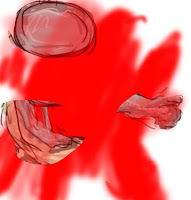
E.G. this zombie creation here to be shown when the zombie dies, to make it I copied the zombie into Photoshop and used the lasso tool to cut out certain body parts and used a red brush to make the pool of blood, and a boundary obstacle I made to slow down the player.
This is the event sheet that I created to make my game with different commands and mechanics.
What I have done here is created global variables for my heroes health, kills, score and zombie speed, which I also made into the zombies instance variable. Then I went to system, after double clicking, to make sure that on the start of the layout the zombies face a random direction, the game over screen is invisible and my barriers are also facing a random direction.
And this is the layout
_________________________________________________________________________________
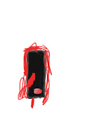
This is my original character that I designed with the original hero as a base. I am also changing the topic from a zombie shooter to a game where you fight robots to survive. The red is the blood of her allies and the black is the oil of her enemies. Her name is Beatrithon.
I am now in the process of designing a robot enemy.
This is the evolution as I have designed my character.
This is my Construct layout since I included my character.
This is the robot sprite I created without the zombie as a template, for the hair I got different shades of brown and used the smudge tool to blend them together until I was happy with the result. In his hand is a teleportation device to transport the hero, if captured(dead), to a facility where they are turned into a robot.
This is the "Killing floor" it is the storage room where most of the humans were slaughtered hence the big puddles of blood on the floor. The blue lines are energy conduits that transmit power to the rest of the ship.
This is the robot after it is destroyed, broken in a puddle of its own oil.
I have also kept the shelves around as they are going to serve the same purpose and look however now instead of a zombie head on top it is a humans.
I am now using this zombie sprite as a boss character with 15 hits but adds 10 to your kill count.
His programming is the same as the ordinary opponents accept for the amount.
_________________________________________________________________________________
Maya Experiments
This is an experiment of mine in Maya made from spheres rectangles and triangles. I did this by mashing these shapes together, the big circle is the power source connected to the cannon, the rectangle is the stand, the small circle is where the energy is stored and charged and the triangle is the point where the the cannon fires.
_________________________________________________________________________________
Animation
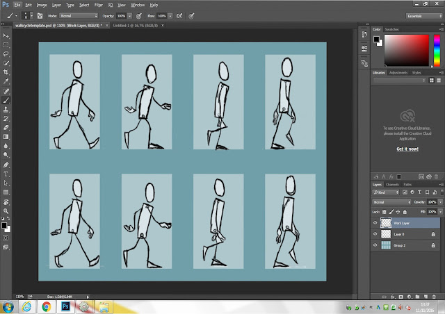
This project will have us create sprite animation using the template below for help.
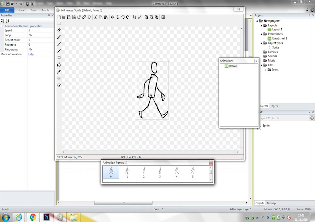
This is the practice sprite that I have completed by tracing the outline from the template.
This is a character I created using the template as a guide. Everything below is the progress I made.
By this stage I decided to increase the size of my character's hair as a little gimmick.
Here I decided to give the hair some physics by having it "bounce" every time his foot goes down.
This is a sprite animation example sheet that I used for inspiration when I was stuck on how to draw my sprite.
_________________________________________________________________________________
Maya Experiments
This is an experiment to make a 3D model of a tap in Maya starting out from a square. This is my final rendered work.
I achieved this from a square by building it with a template of a tap as a guideline, I did this by extruding the square faces using the extrusion tool and using a combination of the W(stretching) and R(Resize) keys to get the overall shape of the template by stretching and resizing the faces. Then by pressing 2 you can make it rounded. To clean up the edges I used the multi cut tool to make the edges less rounded and more realistic.
________________________________________________________________________________
Evaluation
At the beginning of making this 3D tap it was difficult to figure out where to start. Eventually I decided to start from a square then after I got an outline for a tap and put it in the background to act as a guide, that I made use of until the entire shape was made.
The tool I made use of the most is the extrusion tool, pulling out the squares vertexes and faces to match the outline exactly. Another tool I got the most use out of was the cut tool allowing me to separate the faces, I enjoyed using Maya to do this as it calls for skill that I normally don't use, though it does cause a number of problems but I was able to solve them by backtracking, for example when the product was almost perfect and complete there was a section in the long cylinder where it would dip into itself, though this problem was solved by following the lines where it was discovered that the problem was caused by the fact that one time using the cull tool I had made an extra set of vertexes inside, so after I deleted them the situation was solved. Another problem happened when I was making the top of the tap with the dips on the balls to act as decals, the problem was that one of them was misshapen and was a half square, the problem and solution was the same as the previous problem so it was a quick fix.
By the end of the process when I had rendered the tap I was extremely satisfied how well it turned out and how well it filled the outline, though I am disappointed that I couldn't add more detail to the tap to make it stand out more and if I could change anything I would make my tap look more unique. However I believe I have completed the assigned work well as, when rendered and rounded it look like a real tap in real life.
_________________________________________________________________________________
3D animation


No comments:
Post a Comment