This is a simple timeline of animation from 1928 - 2001. Traditional animation to CGI.
Examples:
2D Animation 1929
______________________
CGI
____________________
_________________________________________________________________________________
Painting research
Francis Bacon; Three Studies for Figures at the Base of a Crucifixion
Painted in 1944 by Francis Bacon. This painting was released alongside the firs photographs of the Nazi's and their concentration camps so this painting was meant to reflect the horror of the pictures, witch at the time was completely unheard of especially from the cultured German people. Francis Bacon painted this using oil paint, black waxy crayon on 3 different boards. The three things shown in the painting were related, by Bacon, to vengeful furies from Greek myth. The painting is meant to represent the horror of the concentration camps and the anger and hatred felt by the ones inside since they are based on the vengeful furies from Greek myth. The genre is triptych.
Francis Bacon drew in a Biomorphic Surrealism style that shaped this artwork, this also shaped the rest of his paintings. The things he drew were meant to symbolise humanity and its destructive nature especially in time of war
This is a link to my Kahoot quiz that I made about this painting
https://play.kahoot.it/#/k/24403c8d-f2aa-403d-bfd3-44d0adbf2198
This is a Mindmap of different game ideas and concepts that involve the three creatures from the painting.
_________________________________________________________________________________
2D Platform games
Super Mario
Super Metroid
Mega Man
Limbo
Sonic the Hedgehog
Super Meat Boy
Donkey Kong
Bro Force
Shantae
Super Metroid
Mega Man
Limbo
Sonic the Hedgehog
Super Meat Boy
Donkey Kong
Bro Force
Shantae
Research for Super Mario Bros
Games company; Nintendo
First made; 1983
Art style; 8 bit
The characters involved are; Mario, Princess Peach, Bowser, Toad
Objective; The objective of the game is to defeat Bowser and rescue Princess Peach
Environment; Fictional kingdom of the Mushroom Kingdom, however the landscape and environment are grassy with trees but can vary between caves and ice environments
Point system; You collect points by collecting coins, killing the minions and bosses as well as finishing in as little time as possible
Health; Health is not shown in any way mostly because you can die after one hit by your enemy, however in later instalments you could survive one hit by gaining a power up
Collectables; It is not required to but in the game you have the option of collecting coins to increase your score
Navigation; In the game there is no need for anything like maps because the game play is straight forward and linear meaning that you progress to the next level by going straight ahead to the end goal although there is a hub world where you can choose your next level
Easter eggs; There are no Easter eggs
Style; Sidescroller
Research for Bro Force
Games company; Free Games Company
First made; 2015
Art style; 8 bit
The characters involved are; There are many character but the first 4 are(all characters are parodies of characters from movies) Rambro, Bromando, B.A. Broracus, Brodel walker
Objective; The objective is to save the world from aliens and then from hell and Satan
Point system; You get points at the end based on how many minions you killed and how fast you completed the level
Health; Health is not shown as you die in hone shot, however once you are killed you are granted another life in the form of changing characters randomly based on how many "hostages" you saved during the level, the number is shown in the bottom left corner of the screen
Collectables; No collectables however you get lives by saving hostages around the map
Navigation; In the hub world where you choose your level you can fly around the map in a helicopter, but in level there is no navigation as the map is linear
Easter eggs; The characters are Easter eggs as all of them are parodies from movie characters with the only changes being adding the word "bro" to there name
Style; Run and Gun Sidescroller
_________________________________________________________________________________
Level Plan
This is a practice level plan I did using the template of the Super Mario Bros first level, mapping out where the start and finish is as well as all the obstacles and enemies also the platforms
_________________________________________________________________________________
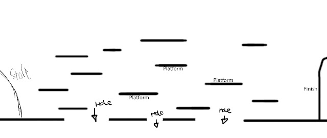
Level plan
This is a preliminary level design plan for my game

_________________________________________________________________________________
Artist interpretations
For this part we were told to do an interpretation of our artists work. Mine is an interpretation of Francis Bacon; Three Studies for Figures at the Base of a Crucifixion the monster on the right.
This is my version that I made by first drawing an outline of the whole shape, then using high opacity colours(light grey, green, yellow orange, black and blue) starting with light grey to colour the whole thing, then I used black to colour in the shaded areas. After all that I used low opacity green, yellow orange, blue to shade over the hard colours with a dissolved brush for a grainy effect.
When I look at Francis Bacon's work the colours I see are light grey. green, yellow orange, black, red and blue and I also see that he used a mostly low saturation /soft brush as it is mostly blended and all of the edges look soft and it is clearly blended. From research I have found that this work is a abstract piece of art, but the art in the whole is a triptych (three paintings used at the same time for the same message).
_________________________________________________________________________________
Power of 2
The power of two in platform games are pixel measurements that allow for a 2D platform game to run smoothly without any lag or bugs from loading in a massive image allowing for the creator to create a decent sized character and assets while allowing for optimal loading power. However when you create sprites using the power of two they should always be the sizes;
64x64
128x128
256x256
512x512
So the computer is able to render textures and wont slow down with lag. When creating backgrounds it is best to use sizes;
1024x1024
2048x2048
Again to render textures.
It can go from 64 to infinity as long as both numbers are in the same timetable.
___________________________________________________________________________________
Background design
In this part of the development we are creating 3 separate backgrounds for the same game to help show depth in our games then after the work is done we are going to store them in our art pack folder.
This is my action sheet most updated.
This is the final piece of my background all together at once. One of the subtle references to the original painting is the sleeping green monster in the middle layer, all of the creatures from the painting all have a big mouth and on other large facial feature, e,g the monster on the right has a giant mouth and a large ear, and if you look closely the sleeping monster has a giant mouth and one large eye as it is a monster inspired by the original monsters. Another connection is the grass in the front layer is the same as in the picture meant to depict that the game and painting have the same environment. The front layer is the cave, skeleton and grass. Middle is the canyon, tree and monster. The distant layer is the blood water fall, cloud and mountain.
I designed it like this as the creatures in the painting look like monsters from hell so the games background is meant to represent a hellscape with monsters, skeletons and dead bodies
This is a reference to the cycle that I want my main character to walk as I want him to walk like a chicken.
These are references for my background, the sleeping dragon is to give an idea as to what a sleeping monster looks like, and the skull is so I have an idea how to draw a realistic skull.
This is the worksheet for my parallax test phase.
This is a video of me testing out the parallax of my game backgrounds on construct 2. I uploaded it to construct by first changing the project size to 1600, 480 and changing the window size to 800, 480 and then uploading the three background layers one at a time starting with the distant layer. When doing this I changed the layers size, as I did with all three, to fit the page size then changed the parallax of all three, distant is 40, 40, middle is 60, 60 and near is 100, 100. Then I created an invisible floor with a prototype player sprite on a new layer to test the parallax. The player is behind the grass because I moved the game layer beneath the near layer.
This is a group of mind maps explaining my design experiments
_________________________________________________________________________________
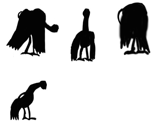
Character silhouettes
This is a group of silhouettes that I considered to be my main character. That I designed based on different characteristics of my painting, mainly the body.
This is my character in a jumping motion, his cape flaps like that because I used the liquefy tool to bend it like that.
This is the sprite sheet I made for my characters walk cycle as well as the jump animation, in the bottom left corner.
This is my character going through his walk cycle that I made.
This is another version of my characters walk cycle with better proportions. I did this when I had finished drawing his legs in a walking position then changing the setting in the top right hand corner of the screen from essentials to motion, changing the settings from "create animation timeline" to "create frame animation" and clicking on the word, then create new frames while in each previous frame I made them invisible from frame 1 to 7, changed the delay(shown right below the images for every frame) on all of them to 0.2 seconds for a more natural flowing monster. The reason that I wanted to make it walk like a chicken is because when I looked at Francis Bacon's paintings for the first time they looked to me like demonic chickens that is sleeping.
This is my character walk cycle with a sort of cape flapping effect. On my blog there are white spots behind my character and I do not know why nor can I fix it.
Platforms
These two are platforms that I am going to put in my game. The bone will be placed in the air and the skull will go under the skull that was already on the screen and will act as a platform for the main character to jump on.
Container
Using the power of two I have determined its size to be 128x128 pixels
I based its design on this real human skull. The colour red is meant to represent blood and brown is meant to show how long it has been there.
This is a sprite sheet for all of my assets
This is the sprite for my collectable, a soul with a colour scheme matching the background. You collect the soul by pressing the right mouse button.
I have now fixed my problems with my sprite as it now travels slower, though still upwards for some reason, though you are now able to collect it. Though a new problem occurred in the form of the collectable being destroyed before you saw it, so I am now planning to have a sort of "destroying spell" wherein you press the D key to destroy the collectable but spawn a black smokey sprite to make it look more exiting.
Here is a PowerPoint telling of some of the Ideas that I am going to put in my game.
___________________________________________________________________________________
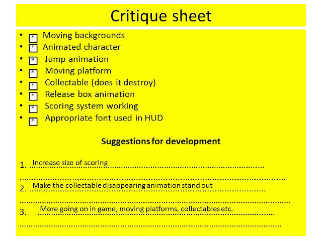
Here is a sheet where my game was criticised during my alpha
I will add the points to my game.
_______________________________________________________________________________
Added Assets
These are assets that I am going to put in my game. The cross will kill my character and the lightning is the attack by using the left mouse button. I have also included a "magic bar" that shows you how many times you can use the lightning attack and once it reaches 0 you can no longer use the attack as the lightning will be permanently destroyed.
This is the enemy in the game that I adapted from a silhouette prototype of my main character.
_________________________________________________________________________________
Instruction sheet
Move: Arrow keys
Double jump: Up key twice
Attack(Limited to 15): Left mouse button
Collect souls: Right mouse button
Switches: Enter key
Restart: Space
_________________________________________________________________________________
Evaluation
Project 2
Evaluation
When I first started working on my game I was influenced by
the work of Francis Bacon, after looking at his painting I decided that the
story was going to be about the least menacing monster on his painting trying
to halt the destruction done by the other two. In accordance with this my goal
for the end of the project was to create a playable demo of my game and store
all of my progress on my blog.
My initial inspiration was the piece Three
Studies for Figures at the Base of a Crucifixion by Francis Bacon that I developed with the aid of
processes of mind maps and experimenting with creature concept art, in the form
of silhouettes to give more creative freedom after choosing the final one.
After choosing the main characters final design I developed it further in
Photoshop after narrowing it down from a selection of other designs based on
the monsters in the painting, which is slightly different from my initial
design. After finishing my character and background design, which was my own
interpretation of what the world inside the painting was like, taking the form
of demons in a hellscape, I took them to construct to start a small look at if
my game would work. During this time I used skills I have never used before and
took me a while to grasp the concept such as using animation frames to make
GIF’s to test my characters. To help further develop my games concept I
researched other 2D platform games that I believed could have something in
common with my game, and the art style of the original artwork such as using
lower saturation and opacity for more surreal colours on my characters and
background, and in Construct 2 I had to use many skills such as global
variables and others that I haven’t used before such as parallax’s and having
to research and understand the uses of the power of 2. Some other choices I
made in connection to the original concepts such as containers for the
collectables, which caused me trouble as I could not open them or make them
work the way I wanted them to including passing right through the containers,
the collectables not spawning and when they did spawn they were all destroyed
at the same time, I fixed this by analysing my event sheet and comparing it to
someone else’s and fixing my mistakes.
In conclusion I was
happy how my game turned out in the end as the gameplay was acceptable the
programing was successful and it felt like a game demo as intended. My
favourite thing about my game is the character design and assets more
specifically their design and colours. If I could change things it would be the
back of the background and making the level longer, but all in all I believe that
this project was successful.


No comments:
Post a Comment